Platform
Event Design
Branded, custom, intuitive
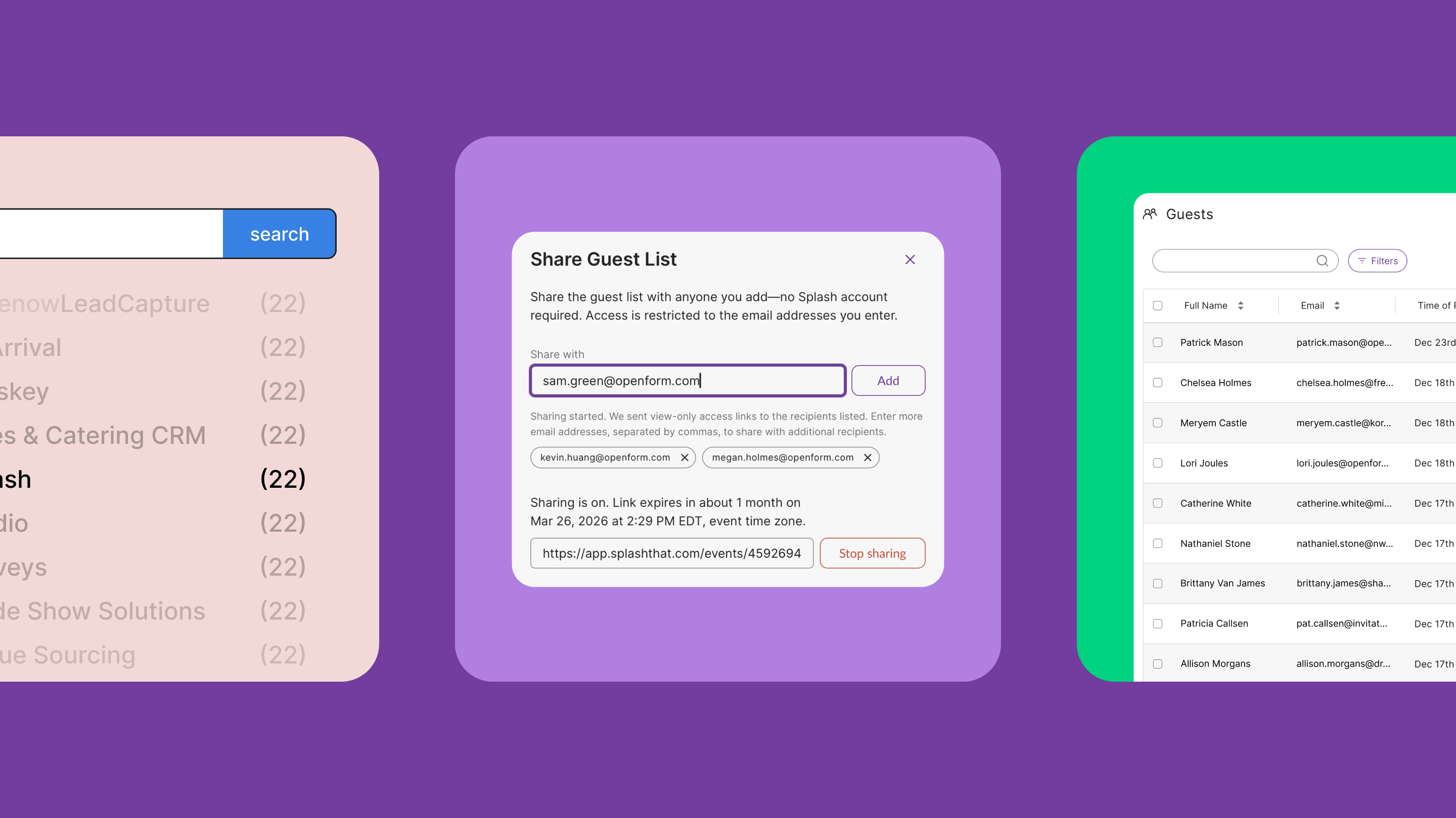
Guest Management
Real-time sync, automation, visibility
Ticketing
Secure transactions, simple payments
Invites and Reminders
Customize, automate, target, measure
Virtual Venue
Engagement, streaming, multi-sessions
Attendance Insights
AI-powered predictions, strategic recommendations
On-Site Tools
Check-in, badge printing, live data sync
Integrations
Real-time sync, MAPs, CRMs
Reporting
Dashboards, pre-built or custom reports
Team Management
User roles, compliance rules, asset library
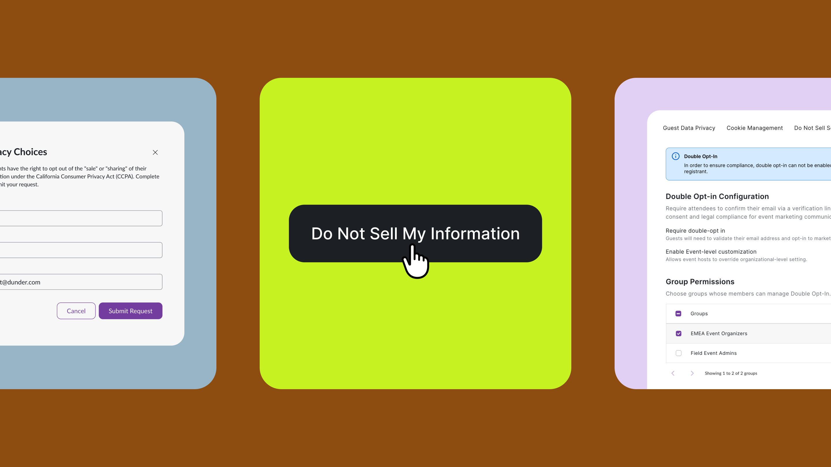
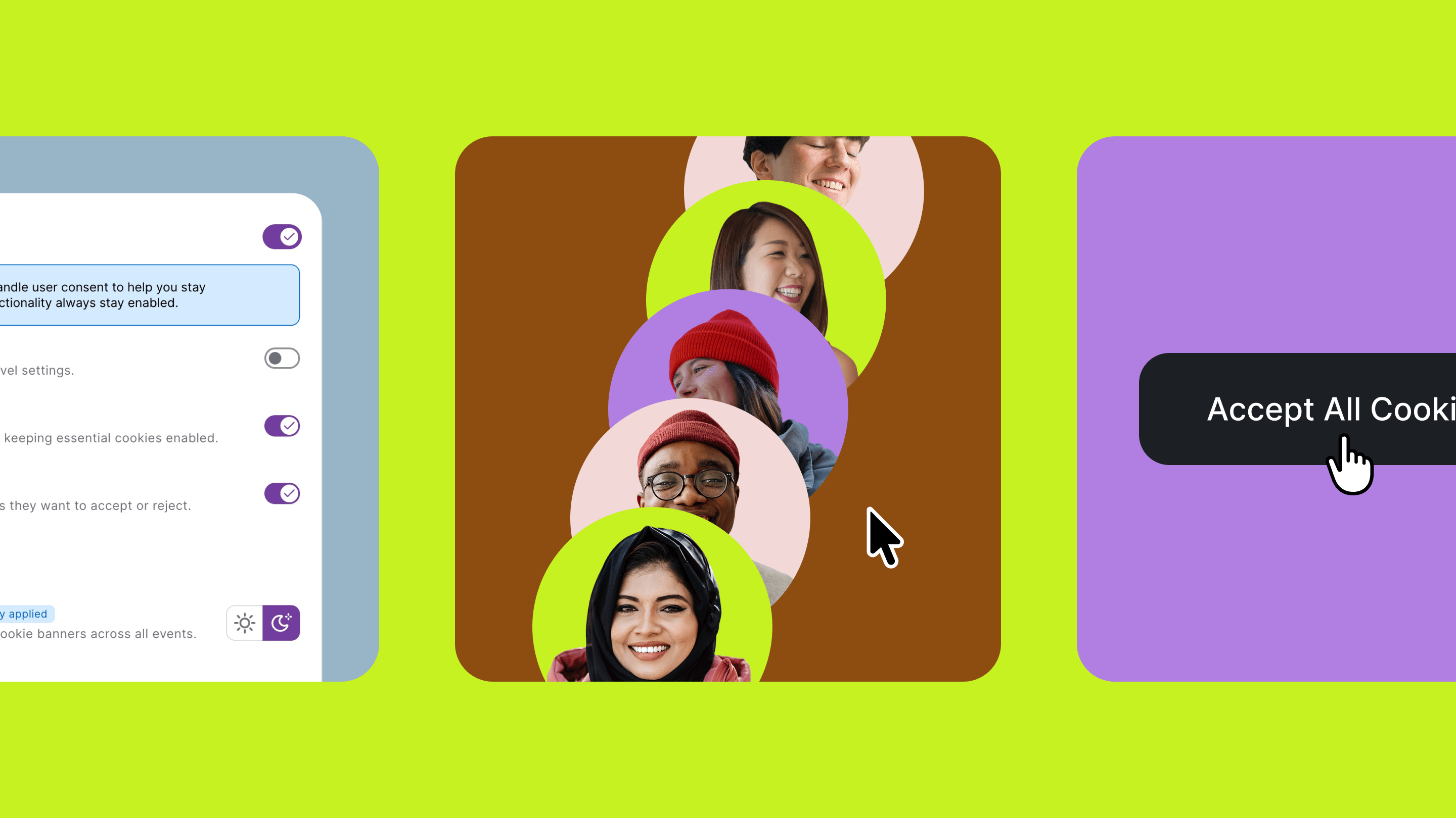
Security & Compliance
Data security, GDPR compliance
Event Calendars
Roadshows, microsites
Explore Platform
Video Platform Tour
Interactive Platform Tours
Splash Themes
Platform Information
Release Log
System Status
Popular Integrations
Marketo
Salesforce
Slack
Solutions
Your Format
In-Person Events
Virtual Events
Hybrid Programs
On-Demand Programs
Your Business
Enterprise
Technology & Software
Retail
Financial Services
Higher Education
Non-Profits
Agencies
Your Events
Conferences
Webinars
Field Marketing
Community
Recruiting
Internal Events
Customer Story
How Expedia Group Cut Event Setup Time by 60+ Hours
Read Now
Customers
Resources
Events Calendar
Join an upcoming event or watch a recording
Podcast
Catch up on our podcast with event experts
Community
Stay connected with event experts
Made in Splash
Design inspiration for your next event
Resource Library
Event marketing tools & webinars
Release Log
What's new at Splash
Blog
Event marketing trends & strategy
NEW
The Event-Led Growth Masterclass
Get certified in the fastest-growing GTM strategy
New Blog Post
The Top 2026 Event Trends Reshaping the Industry
Read Now
New Certification
The Event-Led Growth Masterclass
Deliver more revenue from events.
Enroll Today
4
/
29
Upcoming Event •
Meet Splash
Register to Attend
Pricing
Request a Trial
Book a Demo
Sign In
Book a Demo
Sign In
Book a Demo
Book your personal demo today.
Events Calendar
Resource Library
Podcast
Blog
Community
Release Log
Blog
Updates, ideas, and inspiration for the modern events person.
The Top 2026 Event Trends Reshaping the Industry
New
Event Marketing
Read
Subscribe to get new blog posts delivered to your inbox.
Thank you, submission received.
Your 2026 Cannes Lions Playbook
New
Event Planning
Read
Virtual Event Trends That'll Stand the Test of Time
New
Event-Led Growth
Read
Explore
Event-Led Growth
Event Planning
Event Marketing
Event Management
Event Technology
Company & Product News
Event Experience
Thank you! Your submission has been received!
Oops! Something went wrong while submitting the form.
The Top 2026 Event Trends Reshaping the Industry
Read
Event Marketing
Your 2026 Cannes Lions Playbook
Read
Event Planning
Product Pulse: March 2026
Read
Company & Product News
Product Pulse: February 2026
Read
Company & Product News
Product Pulse: December 2025
Read
Company & Product News
Product Pulse: August 2025
Read
Company & Product News
Product Pulse: July 2025
Read
Company & Product News
Product Pulse: May 2025
Read
Company & Product News
Product Pulse: April 2025
Read
Company & Product News
Product Pulse: March 2025
Read
Company & Product News
Product Pulse: January 2025
Read
Company & Product News
Product Pulse: December 2024
Read
Company & Product News
Show More
Showing
#
of
#
1 / 17
No matching results.
New Certification
Become an Event-Led Growth Legend.
Gain real skills and tools to master the art (and science) of events.
Enroll Today


%402x.png)